
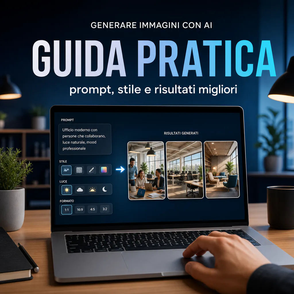
Understanding how to generate images with AI in a useful way doesn’t just mean writing a sentence and waiting for a miracle. The real point is to properly set up the process: objective, prompt, style, controls, and revisions. If you want to start with the basics of available tools, this guide on AI image generators may also be useful to you, because the final quality depends on both the prompt and the engine you use.
Today, image generation models have taken a significant leap. Details such as subject, framing, lighting, aspect ratio, and negative instructions truly impact the result. The problem is that many users continue to request images that are too generic, and therefore obtain outputs that are not credible, inconsistent, or unusable in a professional context.
This guide is designed for those who want to move from a vague idea to a concrete image without wasting time on random attempts. The focus is practical: how to build a prompt, how to iterate, which parameters actually change the output, and how to obtain valid images for blogs, ads, mockups, presentations, or editorial content.
How AI Image Generation Actually Works
When we talk about generating images with AI, we are talking about models that interpret textual instructions and transform them into a visual composition. They don’t reason like a human art director, but they recognize patterns, relationships between objects, styles, materials, lights, angles, and contexts. The clearer the input, the more controllable the output tends to be.
This has two practical consequences:
- A prompt that is too short often produces images that are beautiful but interchangeable.
- A precise prompt increases consistency, utility, and the possibility of reuse.
Many tools also allow you to modify existing images, provide visual references, or request variations. This is useful when you don’t want to start from scratch but want to refine a concept that has already been set.
The Difference Between a Generic Request and a Useful Request
If you write “create a beautiful image of a modern office,” the model will fill in the gaps with standard solutions. If instead you write “minimal B2B office, natural side lighting, light wood desk, open laptop with dashboard, realistic editorial tone, horizontal 16:9 framing,” you are truly guiding the result.
The key principle is simple: don’t ask for “an image,” ask for a precise scene.
Why Results Often Seem the Same
This almost always happens for three reasons:
- vague prompts;
- absence of a usage objective;
- lack of iteration.
Those who want to create images with AI for work must think in reverse: first clarify the purpose, then define the visual content, then optimize the prompt.
Starting with the Objective Before Writing the Prompt
One of the most common mistakes is starting with the prompt text without knowing where the image will be used. A visual for a hero section does not have the same requirements as an image for an ad, a mockup for a landing page, or a blog cover.
Before writing any instruction, define at least these 5 elements:
- final use of the image;
- required format;
- desired style;
- main subject;
- message it needs to convey.
The Right Questions to Ask Before Generating
- Should the image sell, explain, decorate, or attract a click?
- Does it need to be realistic, illustrative, or 3D?
- Should it contain free space for text or a CTA?
- Should it look premium, technical, warm, institutional, or creative?
- Will it be viewed on mobile, desktop, or both?
These questions radically change the prompt. And they also change the choice of tool. If you are comparing tools without a budget, you can find a useful overview of free AI image generators here, useful for understanding the limits and advantages of the most accessible options.
From Abstract Concept to Concrete Scene
Let’s take a simple objective: “I want an image for an article on marketing automation.” That’s not enough. A concrete scene could be:
- marketing team in a modern office, in front of an omnichannel dashboard;
- realistic photographic style;
- neutral and professional tones;
- empty space on the left for an editorial title;
- horizontal format for a blog hero.
At this point, the prompt becomes much stronger because it stops being conceptual and becomes operational.
How to Write Effective Prompts to Generate Images with AI
Those searching for how to generate images with AI often focus on the “right” words, as if a magic formula existed. In reality, a clear structure works better. Recent models respond well to well-organized prompts, not necessarily long ones.
A practical structure could be this:
- main subject;
- context or environment;
- visual style;
- composition or framing;
- light and atmosphere;
- important details;
- constraints to avoid.
A Simple Template That Works
You can use a scheme like this:
[subject] + [action or situation] + [environment] + [style] + [light] + [framing] + [key details] + [final output]
Example:
“Digital consultant working on a marketing automation dashboard, bright and tidy office, realistic photographic style, soft natural light, three-quarter framing, monitor with legible but non-dominant charts, professional atmosphere, horizontal 16:9 format for blog header.”
This approach immediately improves the average quality of the output.
What to Add When the Image Remains Banal
If the result is too generic, usually one or more levels of specificity are missing. Try adding:
- time of day;
- type of lens or distance from the scene;
- materials and textures;
- color palette;
- emotional mood;
- level of realism;
- type of final use.
For example, instead of “modern office,” specify “contemporary office with frosted glass, light wood, and matte black details.” Instead of “illustration,” specify “flat editorial illustration with soft shadows and desaturated colors.”
Style, Realism, and Consistency: Choices That Truly Change the Output
One of the most important steps when you want to generate images with AI is choosing the right style. Many mistakes start here. If you don’t tell the model what kind of image you want, it tends to produce a plausible visual average, but one that is not distinctive.
When to Choose a Realistic Look
The realistic style is useful when you need to:
- illustrate professional services;
- create visuals for B2B landings;
- produce images for ads oriented toward credibility;
- simulate work, technology, or business scenes.
In these cases, it is advisable to indicate photographic details such as light, depth of field, angle, and the rendering of skin or materials. If your focus is specifically on the photographic side, you can also find tips in this guide on the AI photo generator, useful for understanding how to obtain more credible and less artificial images.
When to Choose an Illustrative or Conceptual Style
An illustrative style works better when you need to explain concepts, processes, or abstract scenarios. It is often a more solid choice for technical blogs, educational pages, LinkedIn content, or infographics, because it avoids the stock effect and makes the visual more recognizable.
You can lean toward:
- editorial illustration;
- tech isometric;
- soft 3D;
- minimal flat;
- conceptual collage.
Visual Consistency Matters More Than a Single Image
If you are working on multiple assets, you shouldn’t just aim for one beautiful image. You need to obtain a consistent series. For this reason, it’s worth setting some stable boundaries:
- same palette;
- same color temperature;
- same level of detail;
- same visual language;
- same proportions or format families.
This step is decisive, especially for corporate blogs, e-commerce campaigns, and commercial materials.
Parameters That Truly Influence the Result
Small structured changes can produce big differences. Therefore, in addition to the prompt, the parameters available in the tool you are using must be managed.
Aspect Ratio and Final Format
The aspect ratio is not a secondary technical detail. It is an editorial choice. If you already know where the image will end up, set it immediately.
| Format | Typical Use | Practical Note |
|---|---|---|
| 1:1 | social post, thumbnail | works well on feeds but limits wide scenes |
| 16:9 | blog hero, cover, presentations | ideal for horizontal editorial visuals |
| 4:5 | vertical social | more impactful on mobile |
| 9:16 | stories, short video cover | requires centered and legible subjects |
Framing, Light, and Depth
These three elements have a huge impact on the final perception:
- Framing: close-up, medium shot, wide shot, top view, three-quarters.
- Light: soft, cinematic, natural, diffused, backlight.
- Depth: blurred background, sharp scene, focus on the subject.
If you don’t control them, the model decides for you. And it often decides in a standard way.
Variants and Negative Instructions
Whenever possible, ask for more variants and compare them. It’s one of the fastest ways to improve the result. Additionally, many tools accept negative instructions, i.e., elements to avoid, for example:
- deformed hands;
- random text in the image;
- too many objects in the background;
- cartoon style;
- oversaturated colors.
Control is not always perfect, but it helps reduce recurring errors.
Common Mistakes When Creating Images with AI
Those who want to create images with AI professionally must avoid some shortcuts that waste quality and time. The most frequent problems don’t depend on the tool, but on the approach.
Mistake 1: Prompts Full of Words but Poor in Direction
A long prompt isn’t necessarily a good prompt. If you accumulate adjectives without hierarchy, the model receives a lot of information but little priority. Better less text, more structure.
Mistake 2: No Visual Constraints
If you don’t indicate what to avoid, the model fills the gaps with common patterns. This leads to standard images, stereotyped faces, confused compositions, or fake environments.
Mistake 3: Wanting Everything in a Single Generation
Quality almost always comes through iteration. First you find the scene, then you fix the mood, then you improve detail and composition. Expecting the final result on the first attempt is the fastest way to get frustrated.
Mistake 4: Ignoring Use and Compliance Themes
AI-generated images should not be used superficially. Before publishing them, especially in commercial contexts, you must evaluate the tool’s policy, usage rights, any limits on faces, brands, sensitive references, and transparency of use. On this point, a dedicated deep dive into AI-created images and their correct use in real projects is useful.
A Practical Step-by-Step Workflow to Get Better Images
If you want to stop guessing, use a repeatable process. This applies both to those who create content occasionally and those who need to produce assets consistently.
Step 1: Define the Editorial or Commercial Objective
Write it in one line. Example: “hero image for blog article on AI automations, professional tone, B2B audience”.
Step 2: Describe the Scene Concretely
Specify:
- who or what is seen;
- where it is;
- what it is doing;
- what atmosphere it should have.
Step 3: Choose Style and Format
Decide if you need a realistic photo, illustration, or 3D. Then set the correct aspect ratio.
Step 4: Generate 3 or 4 Variants
Don’t judge the tool by a single output. Compare different versions and observe what works best.
Step 5: Make Micro-Iterations
Modify one variable at a time:
- light;
- angle;
- background;
- level of realism;
- scene density.
If you change everything at once, you won’t understand what actually improved the output.
Step 6: Validate the Image for Its Final Use
An image can look great in preview and work poorly in a real context. Always check:
- readability on mobile;
- space for headlines or overlays;
- consistency with the brand;
- visual impact on the page.
Practical Examples of Improved Prompts
Too Generic Base Example
“Generate an image of marketing with artificial intelligence.”
Problems:
- no clear subject;
- no environment;
- no defined style;
- no final use.
Improved Example for Blog Article
“B2B marketing team in a modern office while analyzing a multichannel dashboard on a large screen, realistic photographic style, soft natural light, neutral palette with blue accents, horizontal 16:9 composition, free space on the left for editorial title, professional and concrete atmosphere.”
Improved Example for Illustrative Visual
“Clean editorial illustration of an automation flow between CRM, email marketing, and AI reporting, premium flat style, soft lines, sober colors, tidy layout, light background, professional rendering for corporate blog.”
In both cases, the prompt is not complicated. It is simply specific.
How to Adapt AI Images to Blogs, Ads, and Mockups
The final step is not about the prompt, but about the use. A good image is not just well-made: it is suitable for the context.
For a Blog
- prioritize clarity and consistency with the article’s theme;
- avoid excess of decorative elements;
- leave space for titles and visual breathing room;
- maintain a uniform style between articles in the cluster.
For Ads
- the scene must be readable in a few seconds;
- the focus should be on the benefit or the problem;
- contrast and composition matter more than fine detail.
For Mockups and Presentations
- take care of perspective and scene cleanliness;
- avoid backgrounds that are too noisy;
- use images that support the message, not distract from it.
If you learn this workflow, generating images with AI stops being a random sequence of attempts and becomes a controllable process. This is where the difference is truly seen: fewer “cute” images, more usable assets.